


AyataCommerce
A 6-week project where I redesigned the website for AyataCommerce, a digital agency, to elevate their brand presence, modernize their visual identity, and improve how clients discover their services. My goal was to simplify navigation, clarify value propositions, and create a flexible design system that strengthens credibility and supports future content growth.

When a digital agency’s story isn’t clear, even great work goes unnoticed.
The Problem
AyataCommerce’s website struggled to communicate their value due to an outdated layout, scattered content hierarchy, and inconsistent visual language. This made it difficult for potential clients to understand their services, navigate smoothly, and trust the brand’s credibility ultimately affecting engagement and conversion.
Where user behavior exposed what the website failed to communicate.
Research & Insights
Users found it hard to understand the service offerings, struggled to navigate through scattered content, and lacked a clear sense of brand credibility revealing a single truth: clarity and structured storytelling mattered more than adding new pages.
Where scattered impressions evolved into a structured brand narrative.
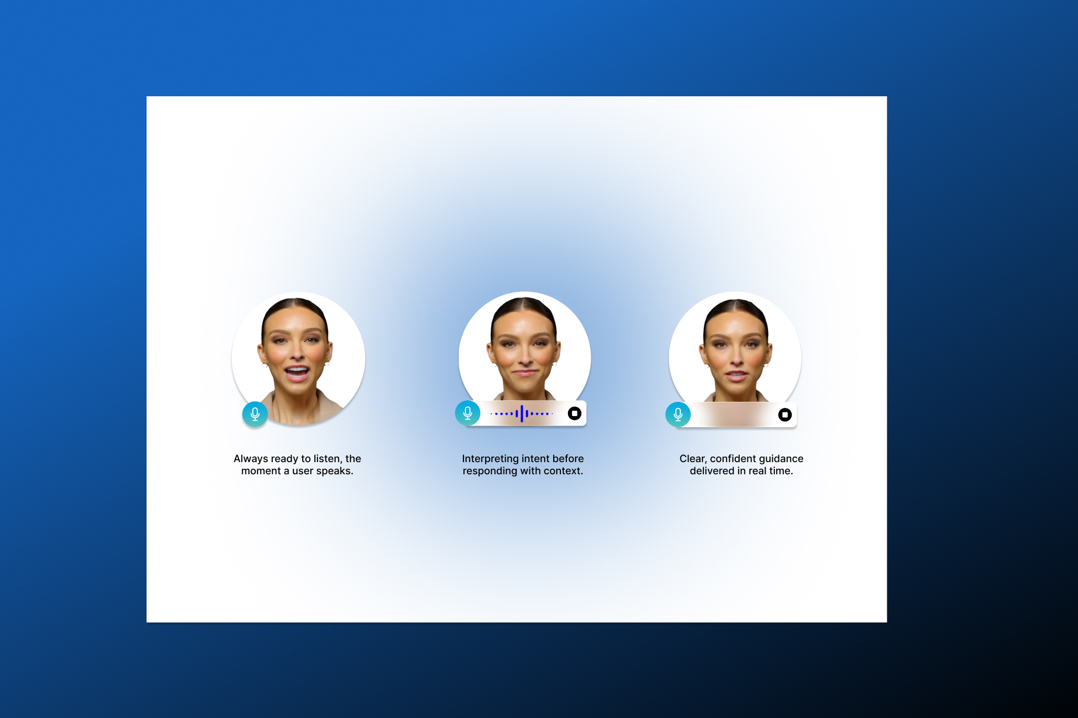
Ideation
By redefining the site’s information architecture, mapping content priorities, applying progressive disclosure, focusing on the most impactful user paths, and shaping reusable design components, I crafted a direction that made the experience intuitive, structured, and scalable for future growth.
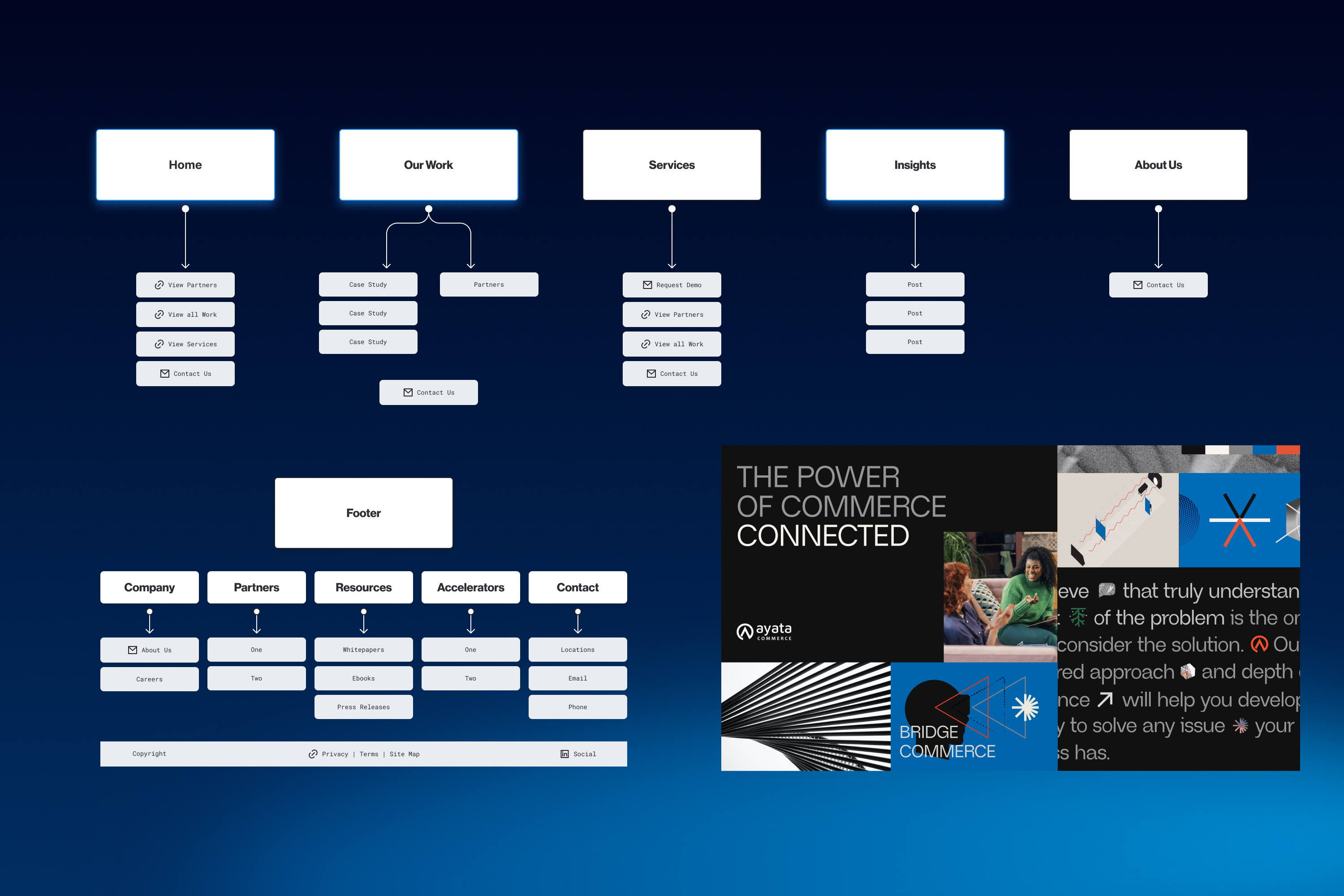
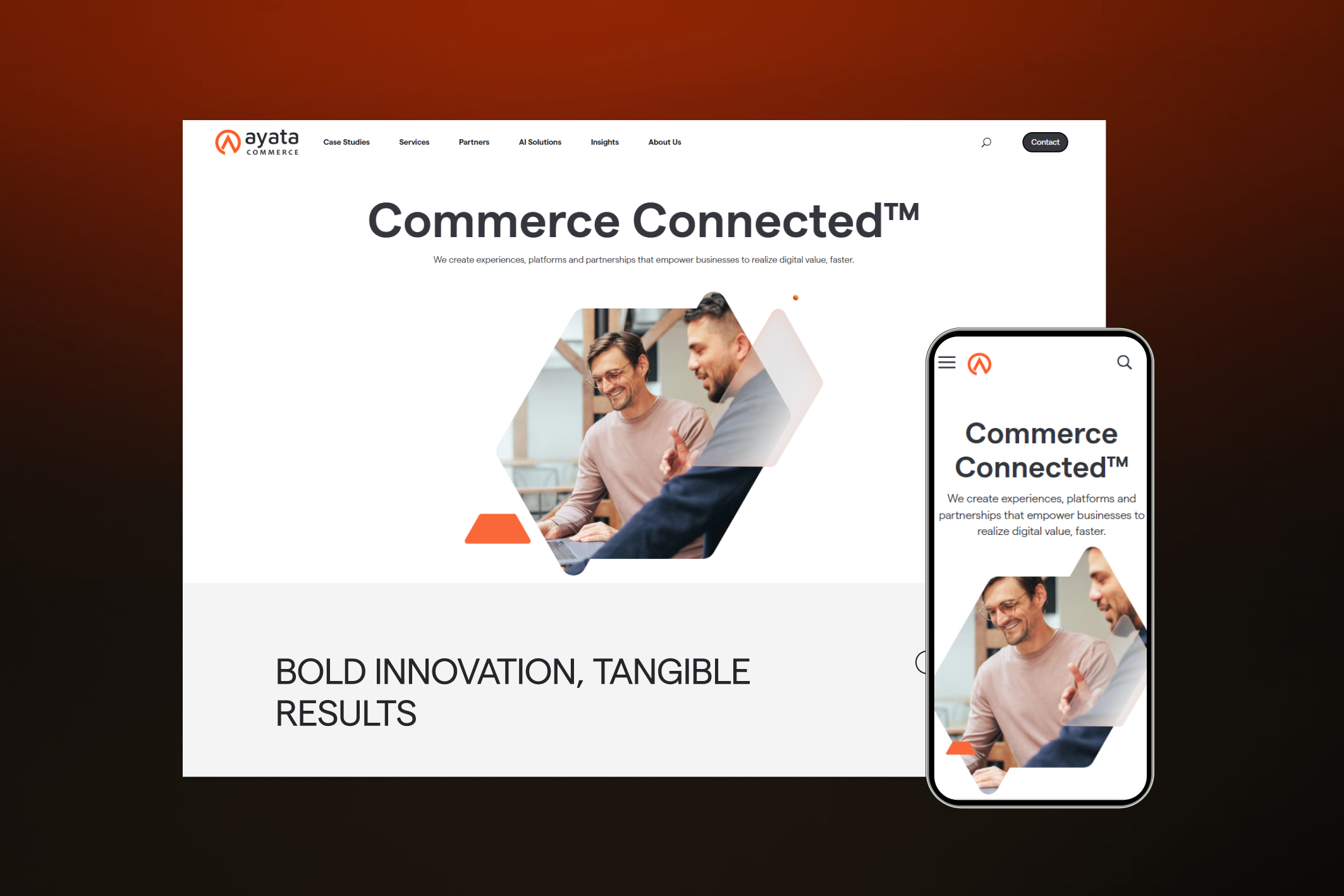
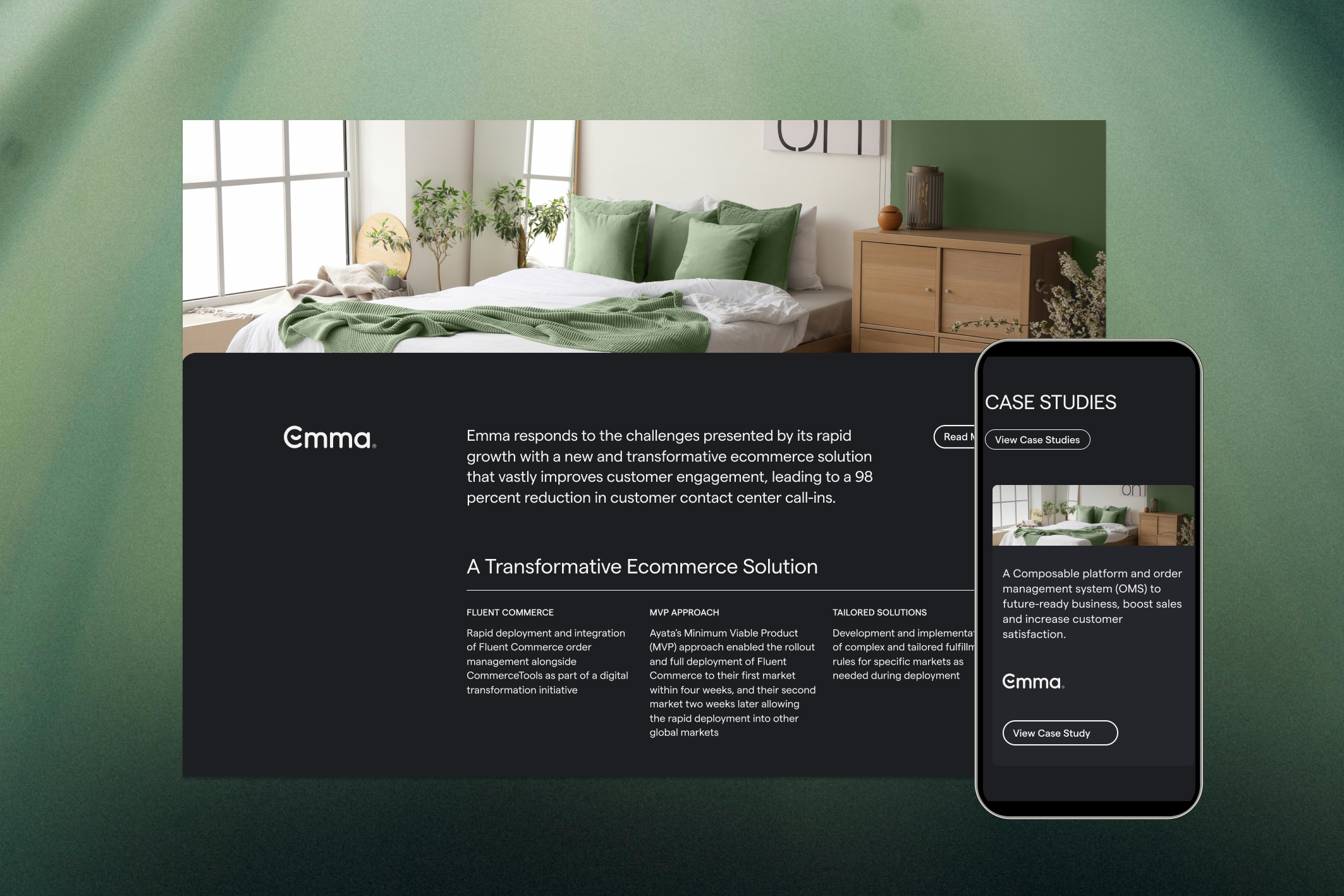
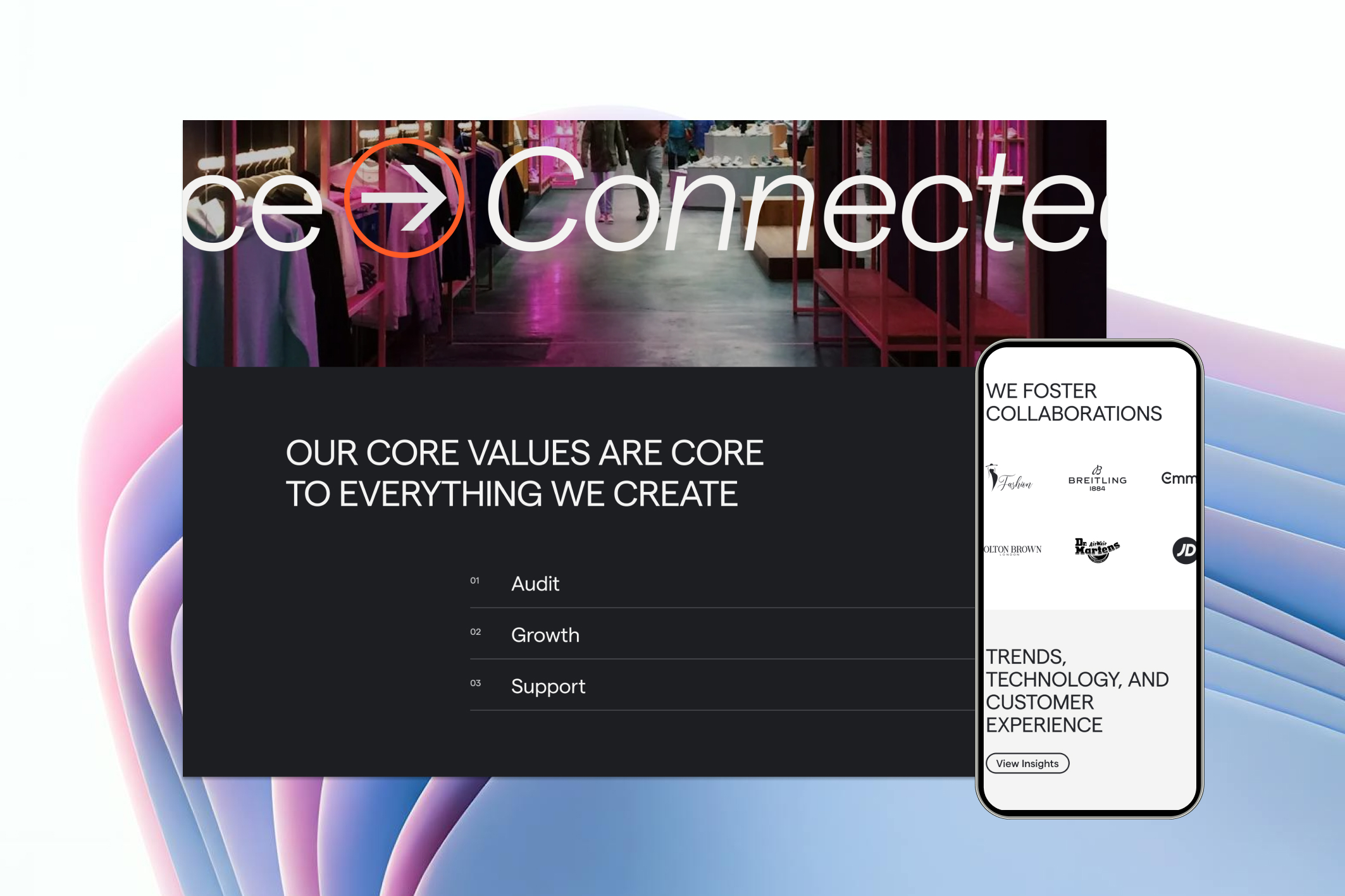
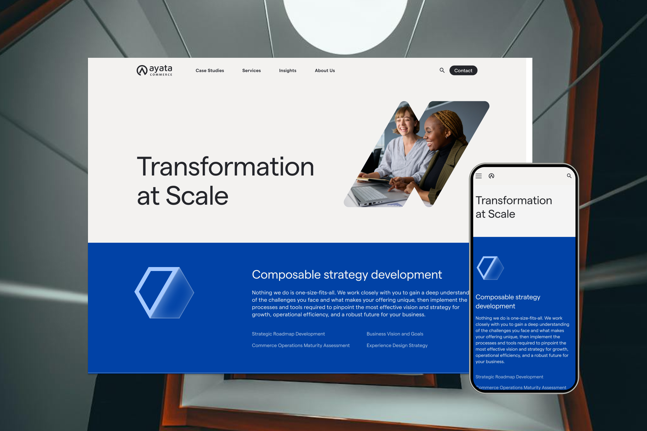
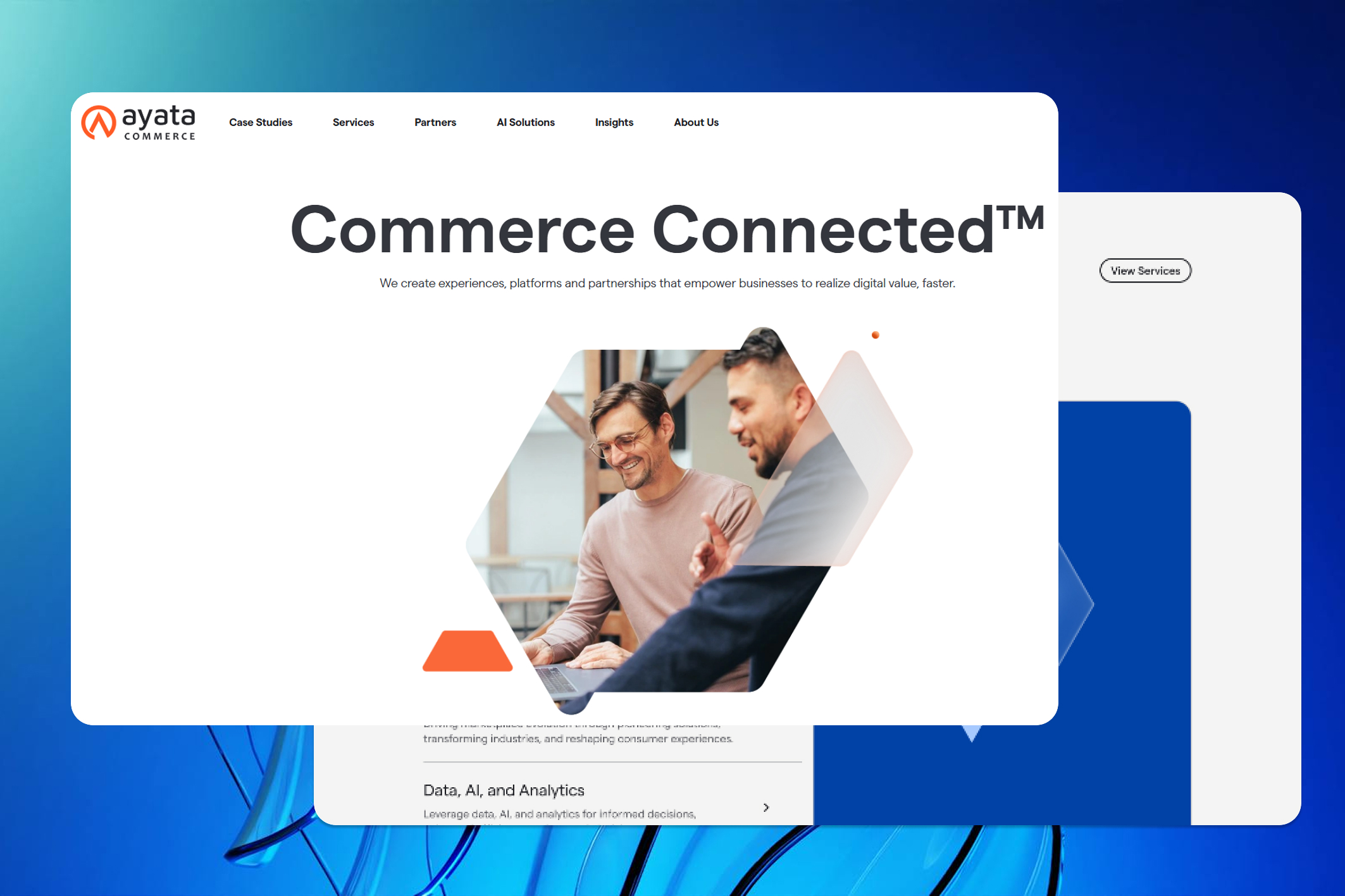
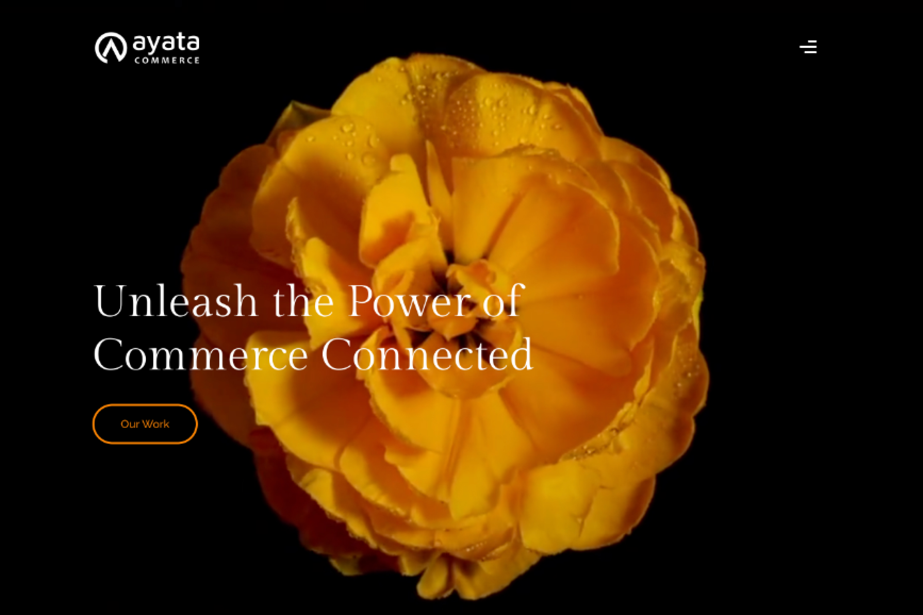
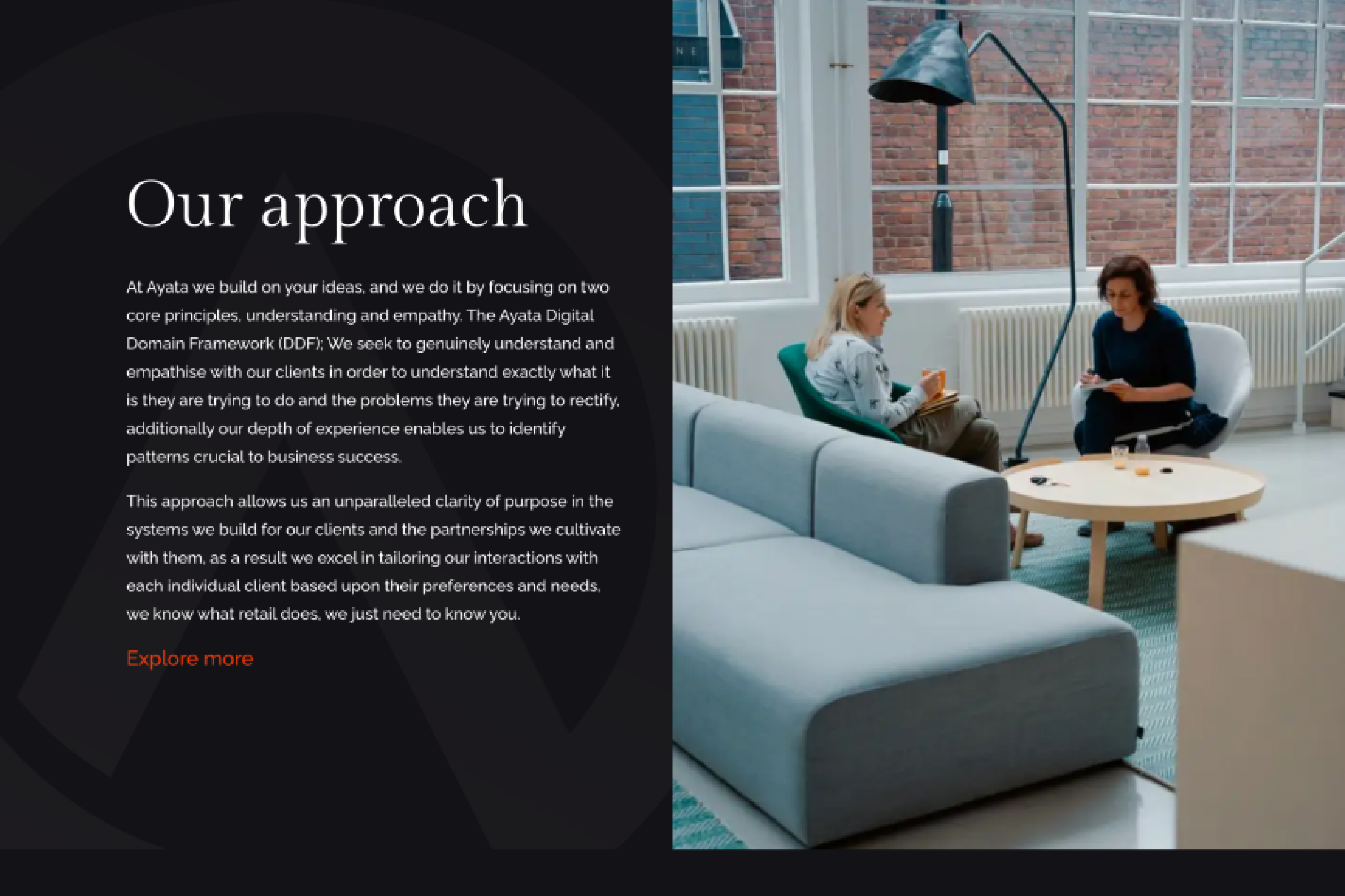
The Solution
simplified navigation, clarified service messaging, strengthened brand presence with a cohesive visual language, and built a scalable design system that helps the agency present its work with clarity and confidence.