

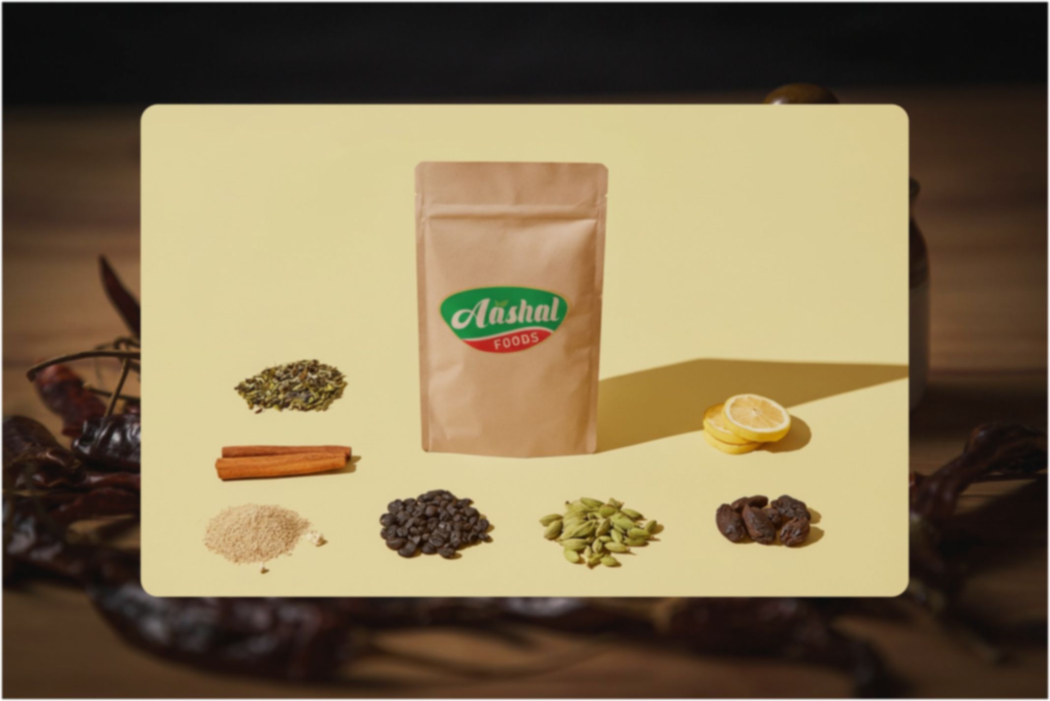

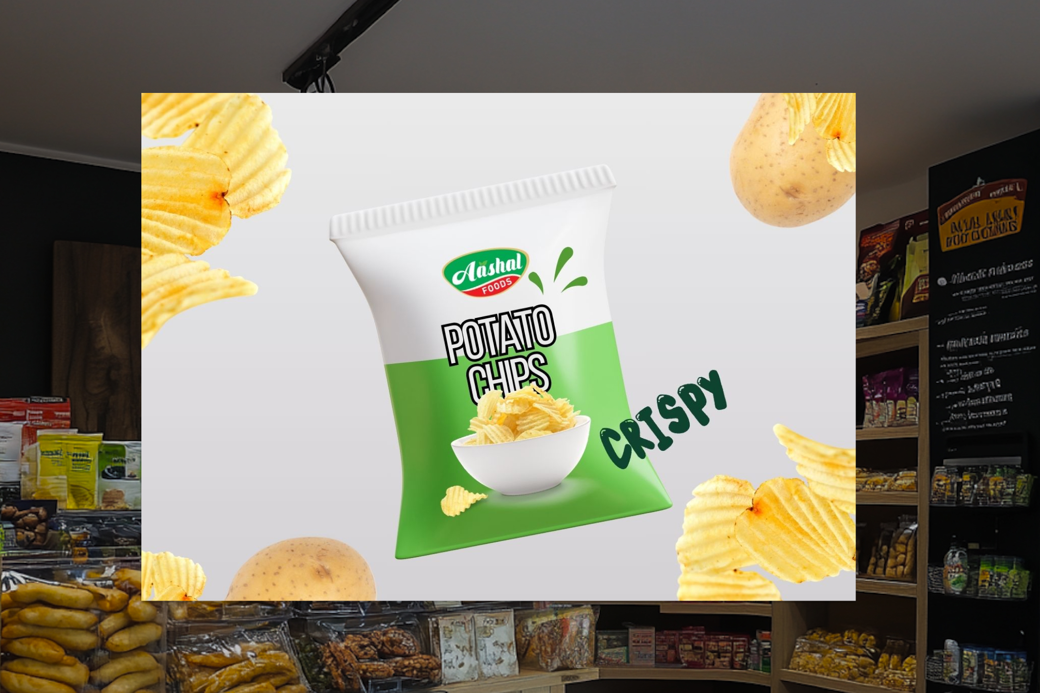


AASHAL FOODS
Aashal Foods, a coffee and spice manufacturer from Wayanad, needed a logo that captured their earthy origins and product purity. I designed a brand identity that blends tradition with modern appeal, helping them stand out in a highly competitve local and export market.

A growing brand needs an identity that captures its roots and its promise.
The Problem
As an emerging coffee and spice manufacturer from Wayanad, Aashal Foods lacked a distinct visual identity. Without a logo or recognizable brand mark, they struggled to communicate authenticity, stand out in the crowded market, or build trust with new distributors and customers. They needed an identity that reflected their origin, quality, and brand story.

Finding the visual language that expresses purity, origin, and trust.
Research & Insights
Research showed that consumers associate authenticity with earthy tones, organic forms, and symbols rooted in local culture reinforcing the need for a logo that reflects Wayanad’s heritage, the natural richness of coffee and spices, and the brand’s commitment to quality.

Where heritage, product essence, and visual symbolism came together.
Ideation
Explored symbol-driven logo concepts inspired by Wayanad’s landscape, refined the shapes to balance modern simplicity with cultural authenticity, experimented with palettes that reflect natural produce, and shaped a visual mark that feels rooted, memorable, and true to Aashal Foods’ identity.

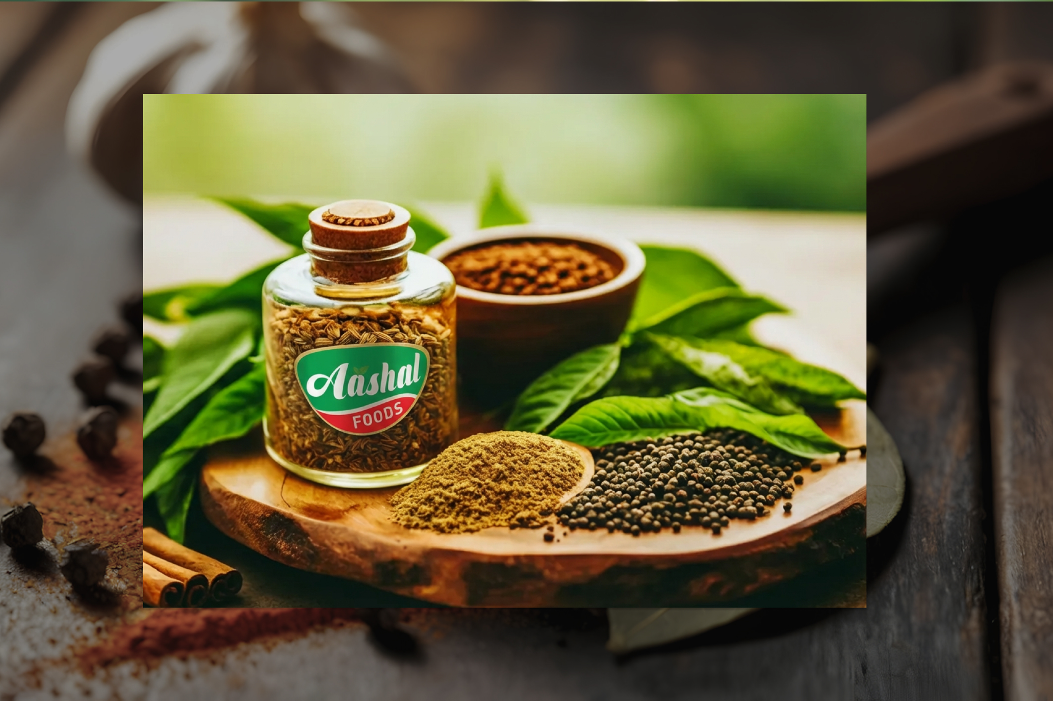
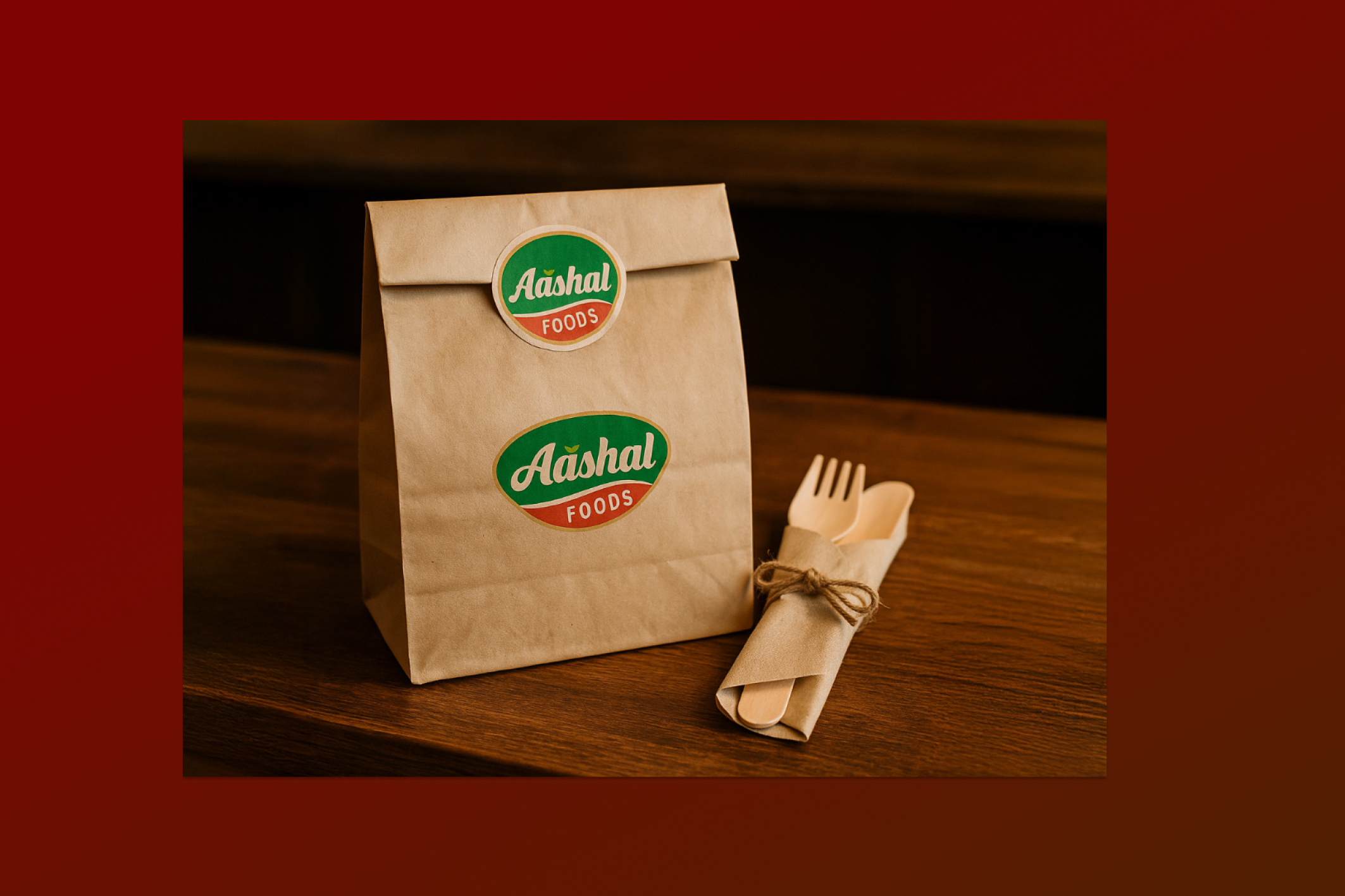
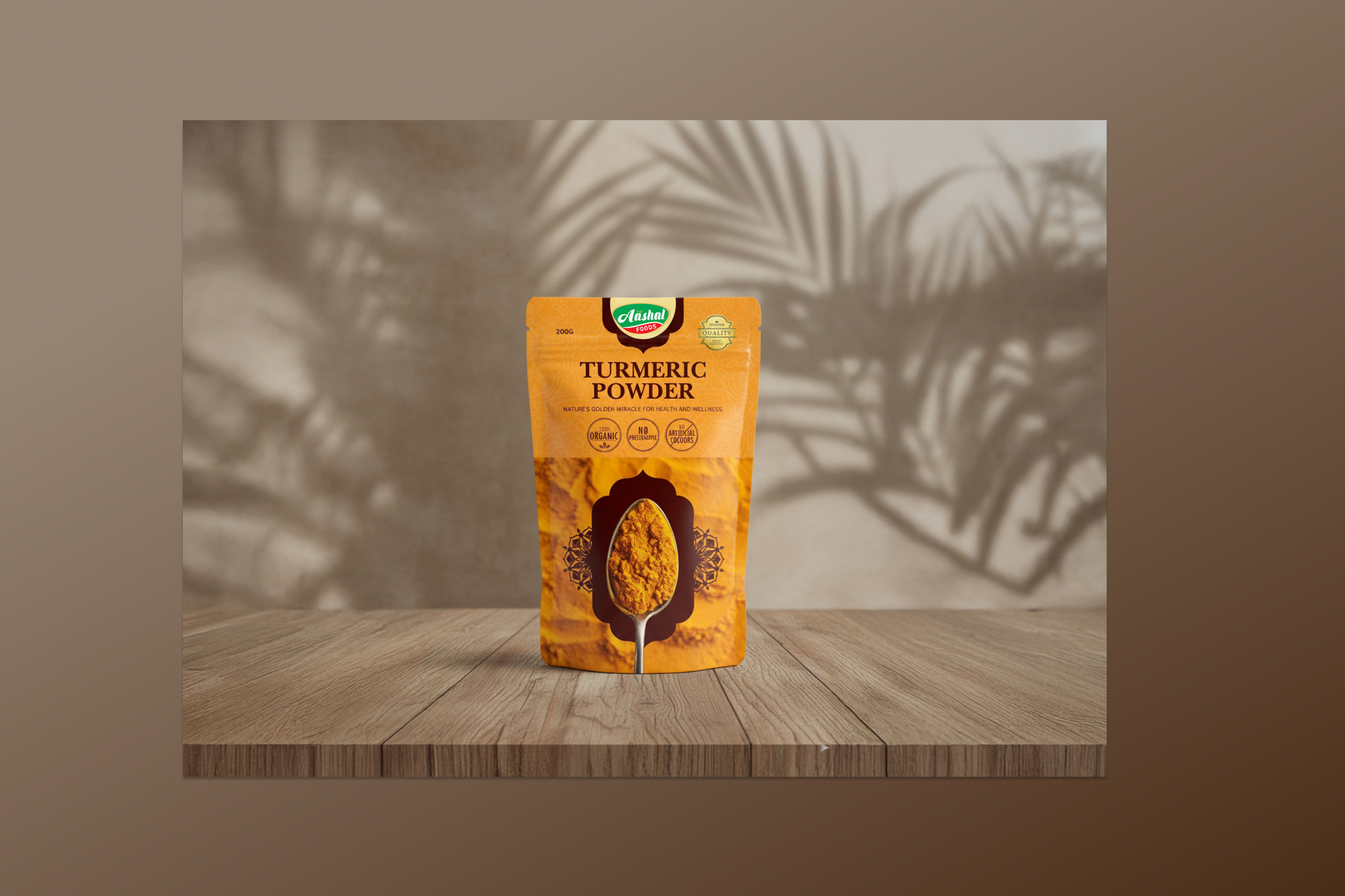
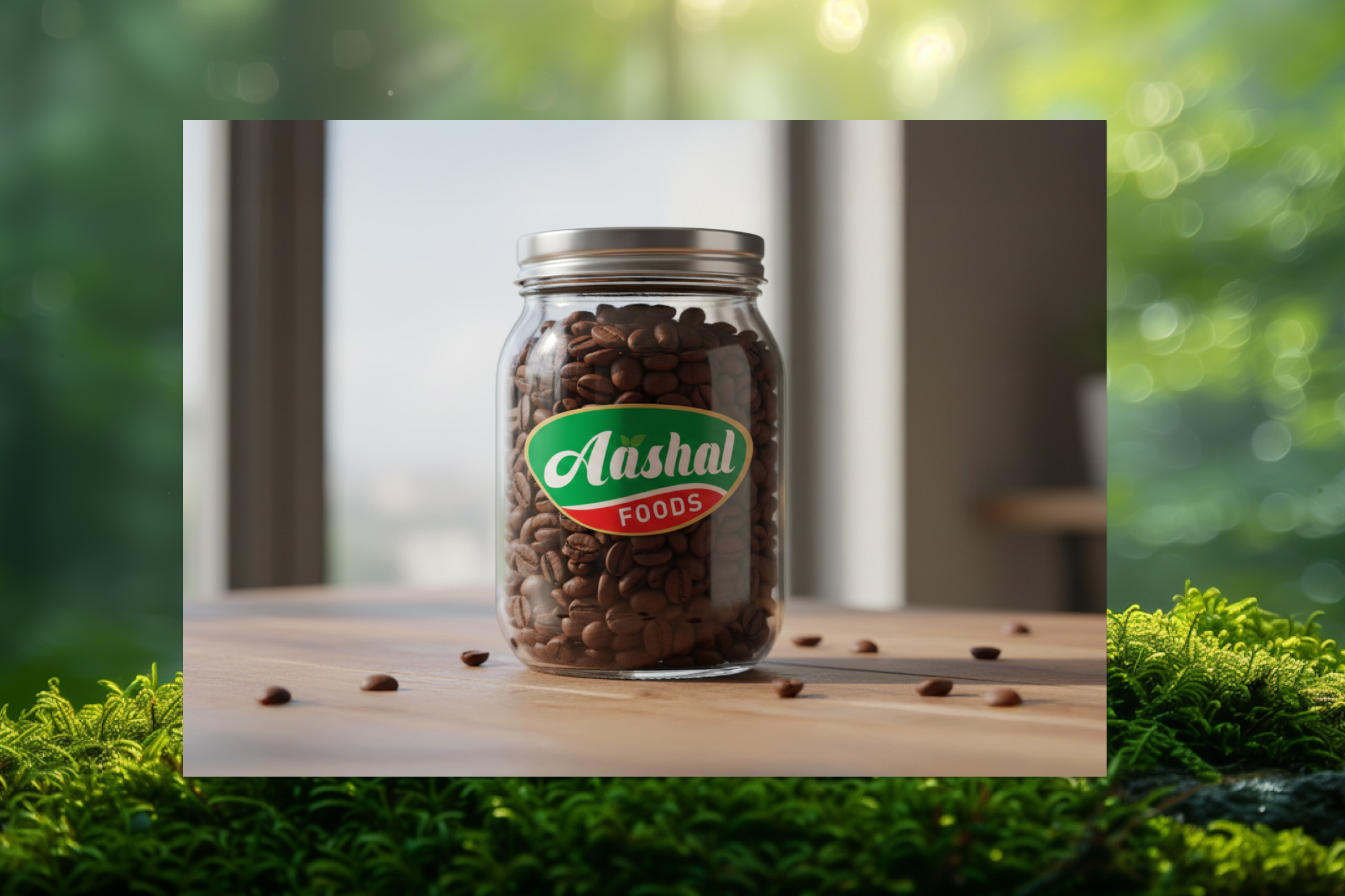
The Solution
Created a clean, nature inspired logo that reflects Aashal Foods Wayanad roots in coffee and spices. The identity is simple, warm, and versatile easy to use across packaging, storefronts, and digital platforms, giving the brand a strong and memorable presence.